What is an A/B test?
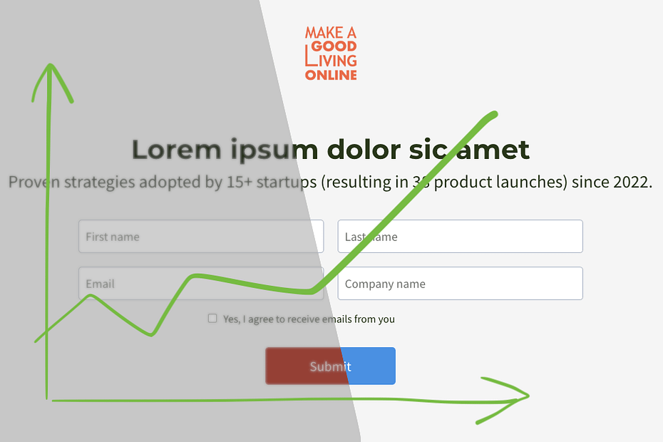
Imagine this scenario: you are running a campaign for your Complete B2B SaaS training cohorts (whatever that means). After a while, you discover that only 21% of the people who see your landing page actually sign up, meaning that you lose 79% of those who click on your ad.
This is pretty low for warm traffic, so how can we improve the conversion rate?
The problem is that there are so many things we can change. Isn’t the heading good enough? Does the form have too many fields? Aren’t the colors effective? How would a countdown timer affect conversion? Some customer testimonials? A stronger call to action?
If we make one change at a time and measure the conversion, it would take forever to optimize the page. Even worse, we wouldn’t compare before and after under the same conditions. If we make the change on a Monday, maybe our visitors will behave differently, now that they aren’t in a weekend mood anymore?
What if we could randomly show different versions of the page to different visitors at the same time? This would give us a fair comparison between them.
This is precisely what an A/B test is. Every big site owner you can think of has A/B tests going on all the time to improve their performance continuously. You should, too.
So, we suspect our visitors don’t like a red button. How about making it blue instead? I’ll show you a concrete example to fight the myth that this is difficult.
How to do it in practice
To illustrate, I will set up a test on systeme.io* because that’s the platform I use due to its completeness and the generous free plan that helped me get started. The steps will look different on a different platform, but the principle will be the same.
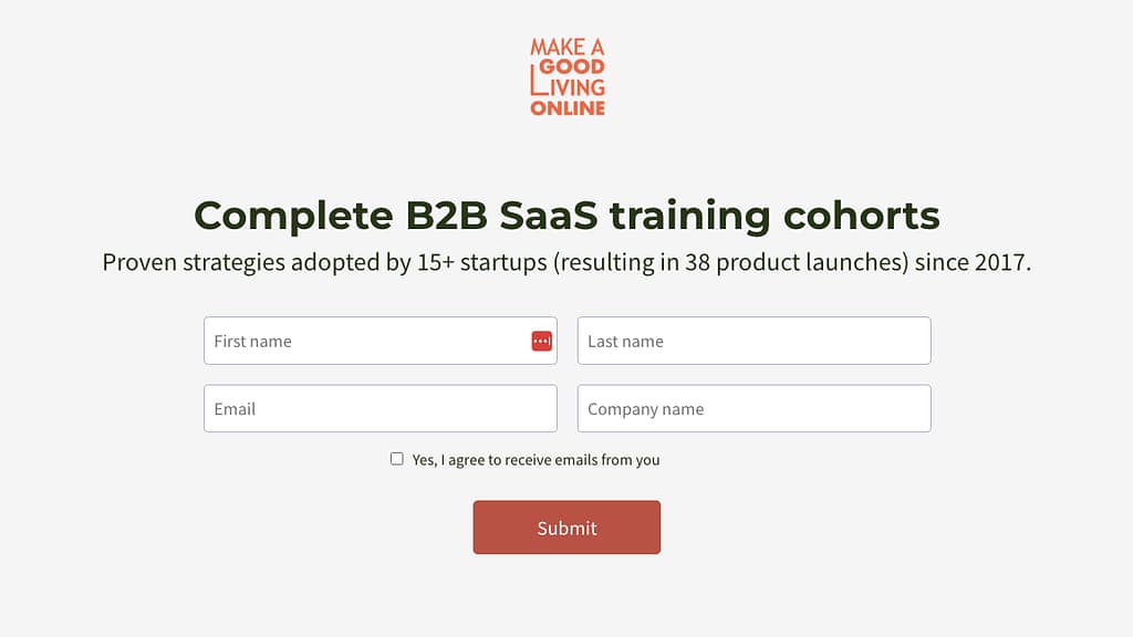
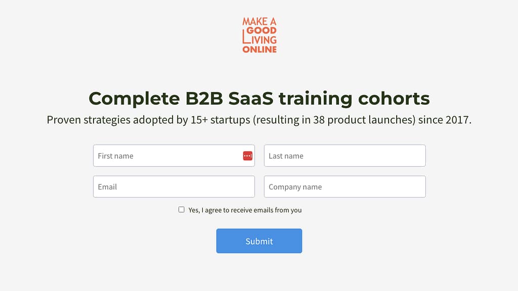
The first thing we do is make a copy of the squeeze page (a.k.a landing page) in the funnel and change the button’s color. We’ll then tell the funnel to start an A/B test. We change only one page in this simple example. Both variants will take the visitor to the same thank you page.
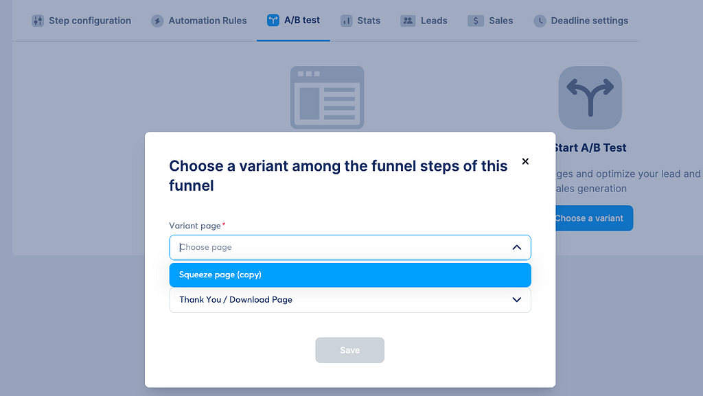
Now, all we have to do is give the funnel enough time to collect statistics for us. The platform will track how many times it shows each variant and how many times the visitor opts in and proceeds to the next page.
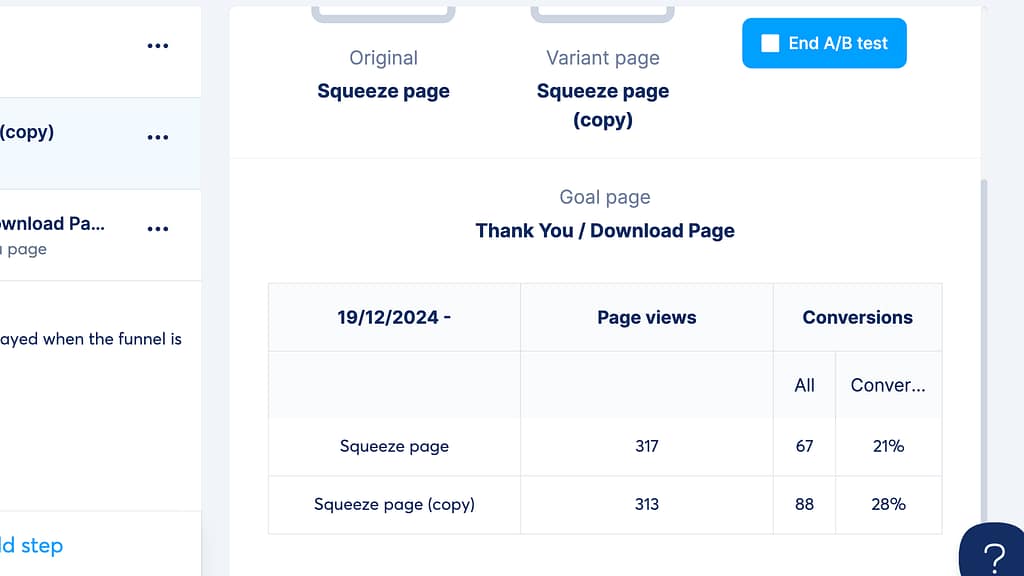
We can end the test anytime we like, but we can watch the numbers even while the test is still running. This is a simulated demo, so maybe we shouldn’t expect to improve the conversion rate from 21% to 28% just by changing the color of one button, but you get the idea. In real life, you would run A/B tests all the time on something on your site. There is always something to improve.
By adopting this approach, you can uncover what truly resonates with your audience, leading to continuous improvements in performance. Embrace A/B testing as a fundamental part of your marketing strategy, and watch your engagement soar!
I recently wrote an article about how to put your business online on a zero budget if you are interested in that topic. If there is something else you want to learn about, feel free to comment below.
— — —
* When there is a product that I honestly recommend, I may share an affiliate link that gives me a commission at no extra cost to you. It helps me keep creating helpful content like this. Thanks for your support!